Three Layer Problem: Integrity, Consistency, Synchrony
Tackling the macrocosmic question of, “What is the zenith of all possibilities for analysis with ProofMode?”
by Jack Fox Keen
In our Lightning Bug blog post, we were tackling the macrocosmic question of, “What is the zenith of all possibilities for analysis with ProofMode?” We are now zooming into the microcosm of a single dataset. We have been working to answer the following question: How do we check the data against itself? From the chorus of synchronicity, we are honing in on the tune of an individual.
First Layer: Integrity
The first and foremost layer to the ProofMode data is Integrity. Proofmode uses OpenPGP cryptography to sign every media file and proofmode data file, and includes sha256 hash values of the media files in the proof data itself. That hash value can also be shared with third-party notary services such as Opentimestamps and Google SafetyNet, sent privately through a messaging app or email, orposted more publicly to services like Twitter or Facebook. These methods all establish that this set of bytes existed as of the time the hash value was shared or published.
- Do the data, hashes and signatures pass cryptographic verification? In other words, are the media files and proof content not tampered with?
- Do the signatures and hash values provided to third-party verifiers and notaries match expectations?
- Does the key used to sign the data match with the person you believe sent the media and proof?
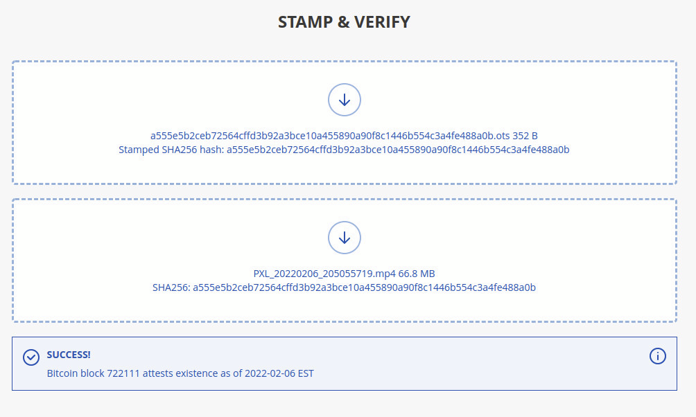 Verification of Opentimestamps signature as outlined in our recent ProofMode release
Second Layer: Consistency
The second layer is Consistency.
- What does it mean for data to be internally consistent?
- This is where we check to see if data contradicts itself. We are only checking the data against itself with no external inputs.
- If we get a batch of data (e.g. a zip file of photos from a protest, a new feature in our latest version) how can we check the photos for internal consistency? What are we looking for?
- A prime example of this is looking for consistency with certain pieces of metadata, such as locale, hardware, and cell network. For example, if someone were to submit a batch of photos, our internal consistency program does a very simple analysis of generating a layered histogram for the number of attributes for each unique device ID.

Such a simple graph can actually tell us a lot. As we can see, three of the devices did not provide any information for the Location Provider (dark green bar, per the legend).
- One device had two different inputs for CellInfo (light blue bar, per the legend), as described in our ProofMode data legend as relating to the nearest cell towers. What this tells us about our data is more qualitative. For example, it could potentially mean that a user covered a large distance.
- Some potential flaws with the layered histogram include the covering of subsequent layers as new layers are added. For example, the Language, Locale, and NetworkType data is not apparent. (100% opacity is used in our example to ensure that the colors match with the legend, as the overlap creates a more difficult mapping scheme.)
- These issues may be resolved by using small multiple subplots in place of one layered histogram.
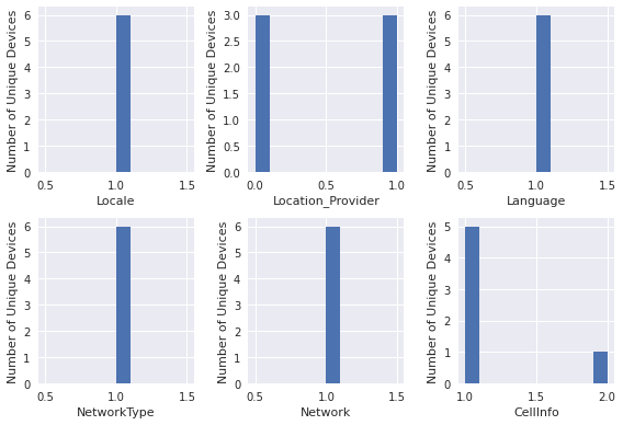
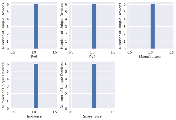
- Other potential issues are that some device attributes, such as hardware attributes, will be expected to have very little variation, and as such will produce a seemingly single layered histogram.

- In such a situation, we have also contemplated an output for a small multiples subplot representation:
Third Layer: Synchrony
The third layer is Synchrony
- Does it match with the quality, frequency, scale, or scope of the event documented or other thresholds/expectations? Here is where we start incorporating external information and see how the data maps to outside data or observations of the event itself.
- Finding causal links between external events and expectations and the _proof mode data_
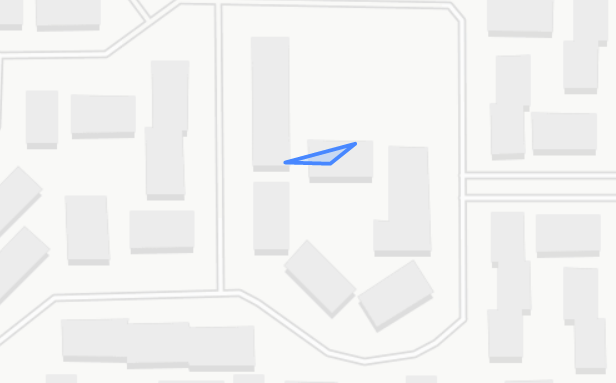
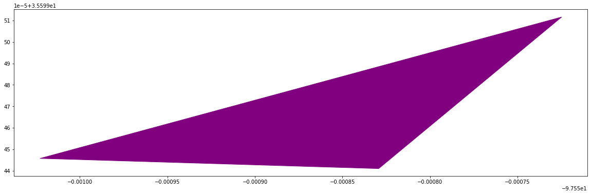
- Working with location data, we have focused on the “shape” or topology of the event. This allows us to remove sensitive information, such as the GPS coordinates themselves, and focus on the convex hull (broadly speaking, a simple polygon containing all the data points) of photos taken at an event, giving us a polygon which can be compared to the boundaries of the event itself. For example, we would expect photos from a protest in Times Square to assume, well, a square shape. Likewise, we would expect a march to match the topology of the area of the streets covered.
As we work through our evaluation of these three layers–authenticity, consistency, and analysis–we of course run into more questions. How does one rank these three layers? Integrity is a binary evaluation–either a hash is matched or it isn’t. Consistency introduces a layer of qualitative evaluation. As users add and remove data collected in their settings, how should this impact the overall metric? For example, as we saw in the histogram above, we have three users who did not include location information. Likewise, we had one user who included information about Networks–had they not included this information, we would not have realized that this device’s cell info includes multiple information for cell towers. How should the overall result be interpreted? How does the “proof” aspect of ProofMode change?
Finally, what is the best and most intuitive way to summarize this information for the end user? Our first iteration of a data summary visual has been a radar chart. Each parameter of evaluation is ranked on a scale from 1 to 5, and each parameter can be evaluated for different attributes of the data.For example, in the following radar chart, we have our three parameters of evaluation performed for the hardware aspects of proof and the software aspects.

We intend to improve by thinking about how to visualize authenticity, a binary scale, with a binary format. How do we coalesce binary results with qualitative results? Perhaps one summary visual is simply unrealistic. These scales cannot easily coexist on one axis.
Other questions that have arisen include: is it possible to show when one individual component is unreliable? What would happen if we collected dimensions of data that were less reliable individually, but more reliable in aggregate? Where can one weak variable support another weak variable to create a stronger metric together? Among the data in our ProofMode legend, which variables could feasibly contribute to these hypothetical scenarios?
Par for the course, answering these questions will inevitably generate a hydra of new questions. In addition to our preliminary analytics stage, we are exploring threat models and working towards coalescing years of conversations and documentation around safety. We are excited for the journey, and encourage feedback on these questions and more via our Contact Page. We also welcome feedback on our GitHub, including the code for our Consistency Check. If you would like to be a part of the active conversation around ProofMode’s development, please join the ProofMode Public Matrix Room!